
Personal Project / Add a new feature
Chase Quest Rewards
How can we motivate individuals to leverage cash back offers on their Chase bank app?

ROLE
UX Researcher, Visual Designer, Interaction Designer
DURATION
Q2 (2023)
PLATFORM
Mobile App
INTRO
In today's world, our $4 coffee has become an $8 indulgence
Even a splash of your favorite coffee syrup now costs an extra 75 cents. In a world where things are getting pricier, we should strive to leverage available financial resources. Cash back offers, for instance, provide a way for small returns to accumulate, potentially offsetting the expense of that $8 coffee. So, why are people neglecting this section of their banking accounts, missing out on an opportunity to let their money work for them?
Problem
Young adults (21-35) aren't fully capitalizing on cash back opportunities. The existing offers lack appeal and, in some cases, lead to abandonment of the feature altogether.
Current state of Chase cash back offers

How might we make the current cash back offer system more enticing so users continuously come back and benefit from it?
our solution
a touch of playfulness and personalization
I blended gamification and personalization to design two core features:
"Quests" - challenges where users can unlock extra rewards by completing all offers listed under a themed "Quest"
"Offers for you" - tailored offers based on spending habits
By integrating both of these elements, my aim was to address users' main pain points with complementary and robust features. The result was an enhanced and personalized cash back interface and system, encouraging users to keep coming back for more.

RESEARCH
Why aren't users making the most of cash back offers?


To get to the bottom of this, I conducted a total of 7 user interviews with the following learning objectives:
Current user habits for using cash back offers on banking apps
How users view cash back offers
What discourages a person from using cash back offers
the main culprits of underutilization
62.5% found the current offer partnerships inadequate
Out of the 5 users who mention this, 2 say that this puts them off from using cash back offers altogether


Those who've used it before tend to push it aside
Users usually have one goal in mind when they access the app and that's to check their bank accounts
Meet Emily - she uses the chase app occasionally
Emily encapsulates the collective aspiration of all our participants to save money but also the friction faced when interacting with the bank app's cash back offers.

Emily Cruz, 28
Sales Technician
About Emily
Emily uses her banking app primarily to check her bank account. She cares about her money-spending and wants to become more financially literate.
Goals
To make better optimal money choices
Pain Points w/ cash back offers
Limited and unappealing cash back offers
Tends to forget about the offers
Not fully informed on how the process works
IDEATION
How can we make the current cash back offer system more enticing and visible?
To help generate ideas, I used the following "How Might We" questions as a starting point of brainstorming. When creating these questions, I honed in on appeal, personalization, and educational empowerment.

To supplement my brainstorming session, I took a look at successful indirect competitors to get inspiration. I was on a lookout for eye-catching features that could seamlessly blend into a banking app like Chase, which has a more established UI structure and information architecture.
Upside
Starbucks
Fetch
Rakuten


FEATURES
Location mapping for nearby gas stations
Lifetime earnings meter
Stars Rewards System
Extra "Stars" incentives through challenges
Scans purchases from any credit card
Leaderboards and community
Alerts you about offers while browsing
Lists out "Popular" or "Hot" Deals
STRENGTHS
Location-based offers
Enticing rewards systems
Strong, simple core feature to earn points
Alerts users as they shop online
GAPS
Offers expire very soon
No collective place to show all claimed offers
Can be seen as a dark pattern to get users to spend more
Hiccups in receipt scanning
Low cash back percentages
WHICH IDEAS MADE THE MOST SENSE?
I was enthusiastic about the ideas I came up with but I also had to consider how well they fit into the user's banking experience without causing too much disruption. Along with that, I also considered how well these ideas would work with the app's technical side. These factors were what drove my prioritization when using the impact/effort matrix.

planning the final concept around attention-seeking
Since users initially found the cash back offers less appealing, their likelihood of revisiting the feature was low. I aimed for concepts that would captivate our users' attention and draw them back to that section.

Quests
Time-sensitive challenges on the cash back offers page promising substantial rewards
Offers for You
Customized, existing cash back offers based on individual spending patterns
how would someone interact with "quests" and "offers for you"?
Our banking app works well for many users, so we don't want to shake things up too much. I placed the entry points for the new features in familiar spots, but also making sure users can easily notice the exciting additions.
User flow legend

user flow: activating quest offers
Scenario: Emily is looking for a quest to participate in

user flow: Activating a personalized offer
Scenario: Emily is looking for an offer that aligns with her interests and spending habits

DEVELOPMENT
figuring out design components
As I thought about how users move through the app, I also considered what types of components would make up their interactions. I drew some sketches of how these parts could look, thinking about how to show progression in a "Quest", highlighting the rewards, what type of rewards users can earn, and how to continuously integrate recommended offers throughout the flow.
Designing components for the interaction
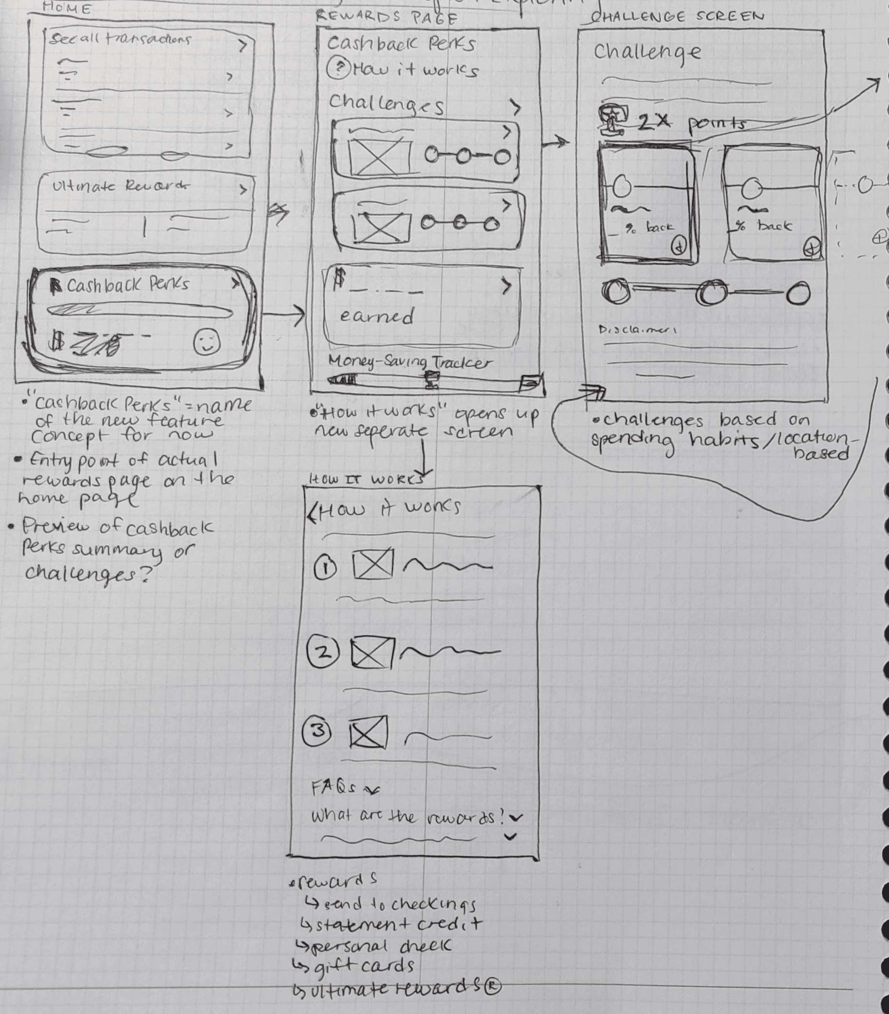
Planning out the first stages of the "Quest" flow
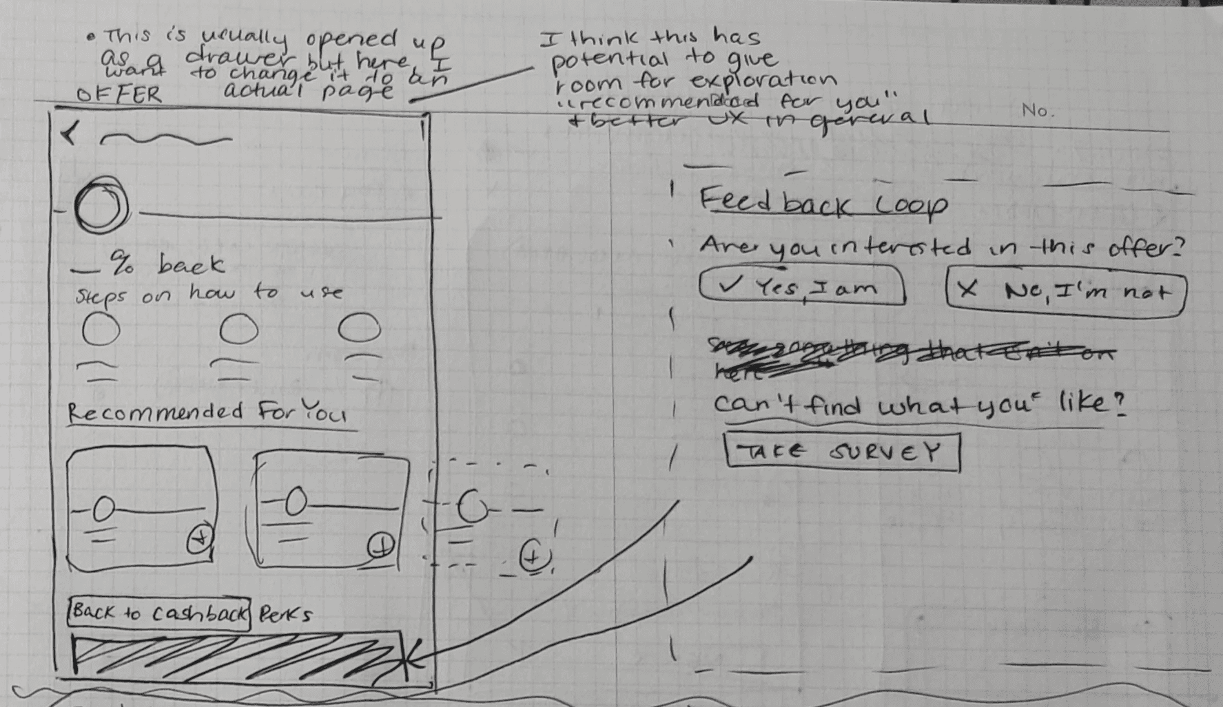
Extending the display of "Offers for you"

Initial "Quest" component card ideation
original vs new states
The original Chase Offers flow to activate an offer was short and accessible through two identical entry points on the home and user's bank account screens. For simplicity, I focused on the entry point from the home screen.
Current State of Chase Offers flow

Home Screen (Entry point highlighted)


Offer Screen
new interactive components
I added quite a few new components to the entry point area and the Chase Offers Screen:

Entry point area features a Quest and a section for recommended offers

Chase Offers Screen now has two tabs for "Quests" and "Offers"
new Flow: completing a quest
To participate in a Quest, users access it from the home screen or Chase Offers Quests screen. Completing a quest rewards users with prizes, ranging from gift cards to extra cash back on specific spending categories. Additionally, there's a "How to Use" section to guide users on what to expect after activating offers.
Key Flow Components

Quest card with progress bar

Different themed quests

Quest details and reward
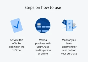
How to use an offer
Flow: User activating another offer under an "In Progress" Quest


new flow: activating a personalized offer
A personalized or tailored offer is accessed under sections labeled with "Offers for you". All offers seen through here are customized based on a user's spending patterns.
Key Flow Components

Offers for you section + context

Different themed quests
Quest details and reward
How to use an offer
Flow: User activating a personalized offer


TESTING
key insights from our users
I conducted 6 moderated usability tests on participants who have used the "cash back" offers feature before on either the Chase bank app or another banking app. These were the top observations that I noted that were common among a majority of participants:

Users didn't notice that "Offers for you" were personalized
When questioned about it, users mentioned they didn't notice or were uncertain about the origin of these offers. This suggests that the personalization aspect wasn't assertive enough.
Users were left even more curious about Quest Rewards
After finishing a quest, users wanted to know more about the rewards and if there'd be a record of all the rewards they'll earn.
ITERATIONS
Making the personalization aspect more prominent
I included a "Your top categories" underneath the "Offers for you" page to better showcase the origin of how these offers are being pulled. A banner has been added to the home page to better highlight the purpose of “Offers for you”.

"Your top categories" specifies the spending categories of a user

Banner to notify users of the new feature and provide extra context
Connecting Quests with Rewards
Now, you'll find "View History" text on the Rewards cards to let users know that the card is clickable and interactive. Once clicked, a restructured “Rewards History” page can be seen with divided categories of “Active” and “Past” rewards. I’ve also provided icons and quest titles in the rewards cards to better correlate rewards to past quests.
Added Rewards History Flow

FINAL PROTOTYPE
conclusion
100% of participants said they would use the “Quest” feature if their banking app provided this
Overall, users really enjoyed interacting with the feature and felt excitement as they looked through the offers for a Quest. Some other strong suites of this project included: prominent expiration dates and steps on how to use.
Honorable Mentions
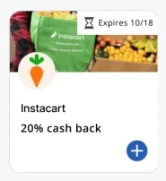
Prominent expiration date on cards
Steps on how to use an offer
key takeaways
During Research: Consider a secondary target audience and people who don’t use the feature or don’t know what it is.
During Research: It’s all about the “why”. What else do people look at? Why are people using the app?
During Development: Don’t settle. It can be worth changing up details within flows for the sake of discovering interesting user data and observations down the road.
Next Steps
Investing more work into Quest Rewards:
Tie in purchases related to Quest Rewards earned (transactions and the amount of cash back received from purchases)
Provide more context for how rewards are used and what counts as rewards
Contemplate more on the content that lies behind the help icons